
MyGiving Brand Guidelines
UI Patterns
The building blocks of the MyGiving product experience: buttons, cards, navigation, and the layout patterns that tie them together.
Reference Screens
ConfirmedThe actual shipped screens every specimen below is extracted from, shown whole so the components can be seen in their real context rather than taken on faith.
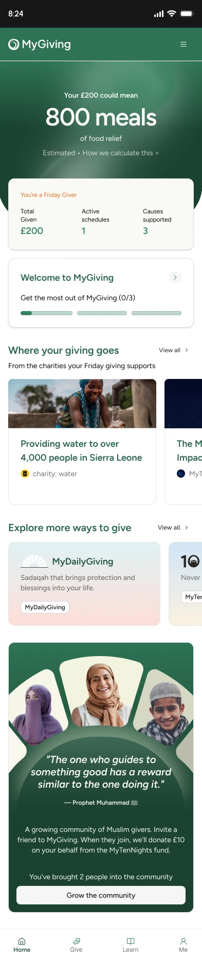
Home
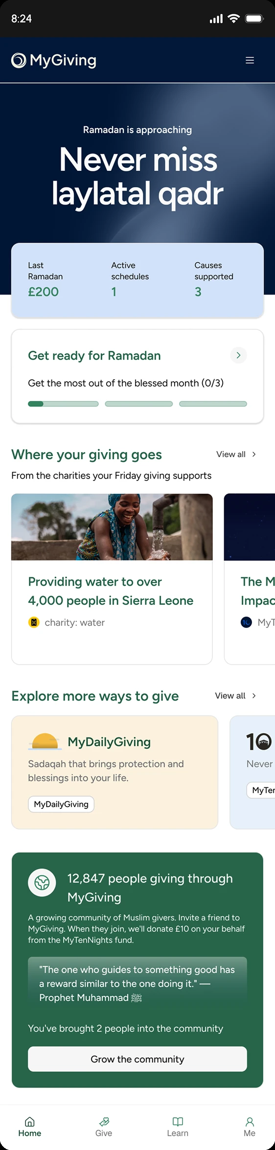
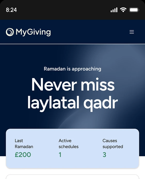
Home, Ramadan skin
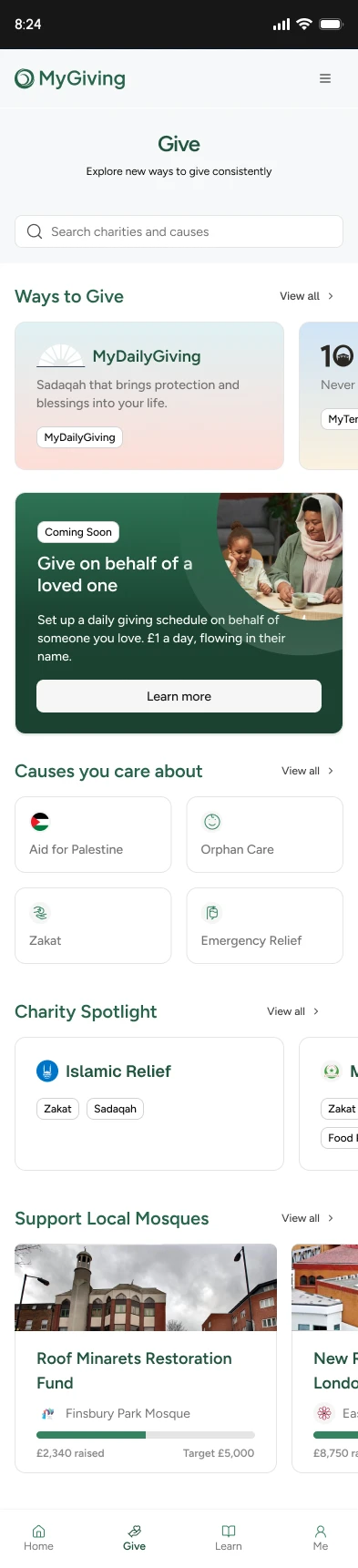
Give
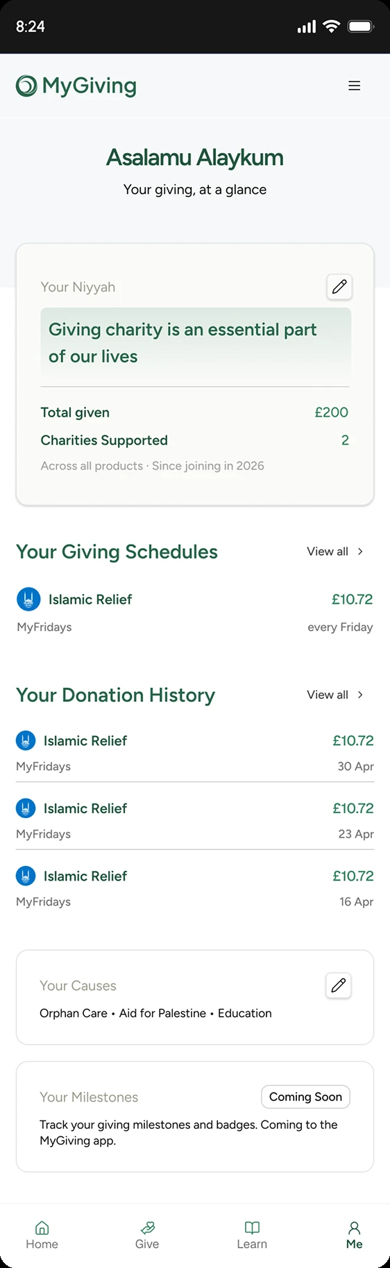
Me
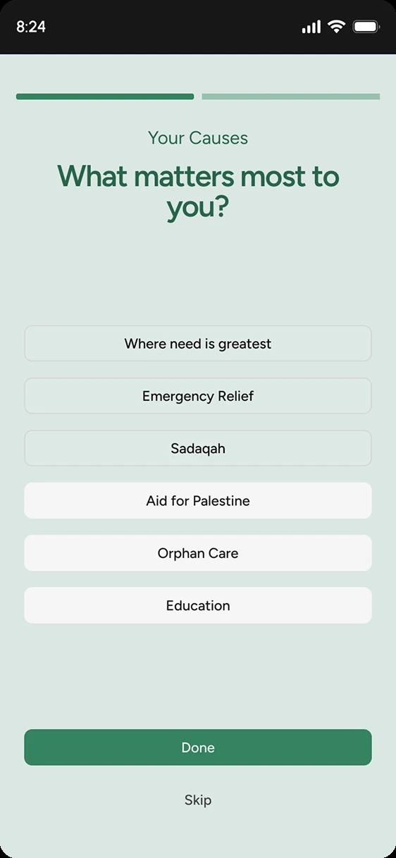
Onboarding, pick causes
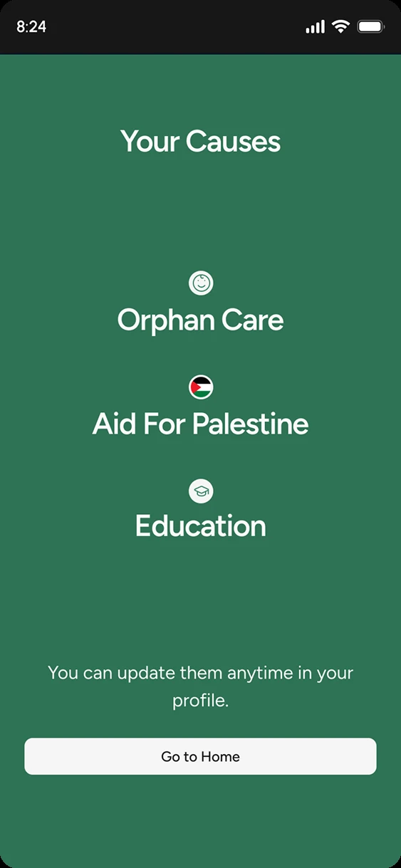
Onboarding, confirmed
Elements
ConfirmedThe smallest reusable pieces, buttons, chips, avatars, inputs, found consistently across Home, Give, Learn, and Me.
Primary button (on dark surfaces)
Secondary button (outline)
Nav pill, active vs inactive
Chips / tags
Avatars
stacked ring, used for “12,847 people giving” social proof
Search input
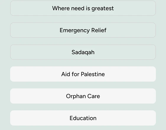
Selectable list row (multi-select)
Selected state drops the border and fills cream, no checkmark or tick icon. Taken from the onboarding causes picker, not invented.
Reference
Icons throughout are lucide-react, 16–20px, always inheriting text colour rather than carrying their own fill.
Foundation
ConfirmedBuilt on shadcn/ui + Tailwind v4, hence the border-border, bg-accent, text-foreground tokens running through the shipped markup rather than raw pine/cream classes everywhere.
Destructive / error state
Open, proposedNo brand-specific error red exists yet, the shadcn kit’s Badge and Button pages still use Tailwind’s stock red (#ef4444) for their “Destructive” variant, and the shipped prototype has no failed-donation or form-error state to check it against. Worth a deliberate decision before one gets built ad hoc.
Components
ConfirmedOne card recipe, rounded-xl border p-6 shadow-sm, repeated across three surfaces rather than a different shape per context.
White
Default surface. Ways to Give, charity spotlight, activity rows.
Cream
Soft/secondary surface. Sits inside an already-white page region to separate a sub-block.
Dark (pine)
“Coming soon” and dark-band feature cards. Never greyed-out, dark instead of disabled.
Ways-to-give card

Same card, same icon slot, same “Learn more”-style pill, only the gradient and mark change per spoke. Appears identically in the Home “Explore more ways to give” row and the Give tab “Ways to Give” row.
Media card (carousel item)
Islamic Relief
Emergency Relief, Zakat
Progress bar (fundraiser)
£1,890 raised · £10,000 target
Segmented control
List row, with divider
Islamic Relief · £10.72
Muslim Charity · £5.00
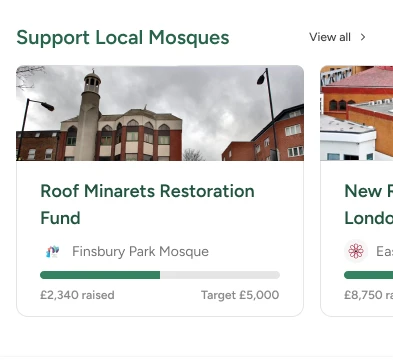
Campaign card (image + progress)
Roof Minarets Restoration Fund
Finsbury Park Mosque
£2,340 raised · Target £5,000
Reference
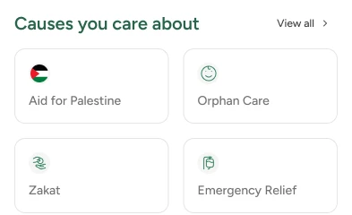
Cause tile (icon grid)
Aid for Palestine
Orphan Care
Zakat
Emergency Relief
Reference
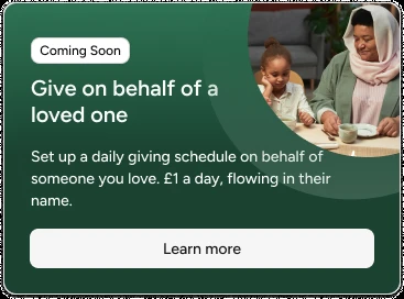
“Coming soon” feature card
Give on behalf of a loved one
Coming SoonSet up a daily giving schedule on behalf of someone you love. £1 a day, flowing in their name.
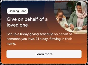
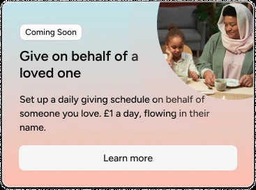
Real version bleeds a photo into the top-right corner instead of sitting flat, and reuses the exact same layout recolored per spoke:
Community / social-proof card
12,847 people giving through MyGiving
“The one who guides to something good has a reward similar to the one doing it.”
You’ve brought 2 people into the community

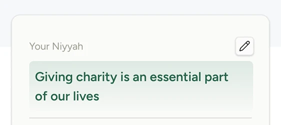
Editable field (Niyyah)
Your Niyyah
Giving charity is an essential part of our lives
Label, value, and a small square edit button top-right, the same recipe wherever a user-authored line needs editing in place rather than jumping to a settings screen.
Reference
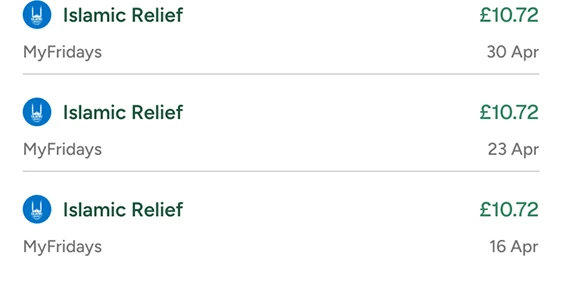
Donation history row (dated)
Islamic Relief
£10.72
30 Apr
Islamic Relief
£10.72
23 Apr
Heavier than the plain list row above, org icon plus amount-over-date on the right. Used for transactional history; the plain row is for browsing/index lists.
Reference
The last two recur near-verbatim across Home, the post-donation share screen, and the referral screen, same dark card, icon avatar, quote, and single CTA each time. Confirmed against the shipped screens rather than assumed.
Patterns
ConfirmedLayout-level habits the prototype repeats on every page, not tied to any one component.
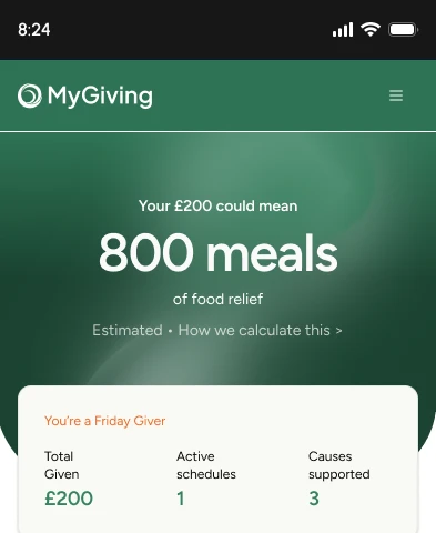
Hero band fading to content
Your £200 could mean 800 meals of food relief
Content card overlaps the band by 12px, the fade from saturated pine to white/cream happens through this overlap, not a gradient.
Reference, Home, default
Reference, Home, Ramadan skin
Horizontal scroll → grid on desktop
flex overflow-x-auto -mx-4 px-4 on mobile, md:grid md:grid-cols-2 md:overflow-visible on desktop. Same markup, no separate desktop layout.
Sticky top nav, mirrored bottom bar on mobile
The bottom bar isn’t a simplified mobile menu, it repeats the exact same four destinations as the header.
“View all ›”, not a button
Every list or carousel ends in a quiet text link with a chevron (View all ›), never a bordered or filled button. Buttons are reserved for the one action that matters on a screen; index/browse affordances stay text-weight throughout.
Two progress bars, two different jobs
A thin 2-segment bar at the very top of a screen marks progress through a flow (onboarding’s causes picker, step 1 of 2). The pill-shaped 3-segment bar inside a card (“Get the most out of MyGiving (0/3)”) marks progress through a checklist. Same idea, never the same component, don’t reach for one to build the other. See the onboarding and Home screens in Reference Screens.
Skin-Swappable Templates
ConfirmedPer Family of Products, cross-spoke features (like “Give on behalf of a loved one”) reuse one layout and simply swap the tint. Same card recipe as above, only the accent colour changes.
Give on behalf of a loved one
Recolored for MyTenNights
MyTenNightsGive on behalf of a loved one
Recolored for MyFajr
MyFajrGive on behalf of a loved one
Recolored for MyTenDays
MyTenDaysGive on behalf of a loved one
Recolored for MyFridays
MyFridaysLayout, spacing, and card recipe are identical across all four, per Color’s spoke ramps. Only the strip and chip colour change.
Proof, not assumption: the whole Home screen, recolored
Default
Ramadan / MyTenNights
Every card, every layout decision, identical down to the pixel, the community card at the bottom is the one thing that didn’t get recolored in this build, worth flagging as either a miss or a deliberate “always-green” exception.
Need access to the design system?
For Figma access, source files, or component specs beyond what’s documented here, reach out to the MyGiving design team.