
MyGiving Brand Guidelines
Motion
How the brand moves, mostly still, briefly transitioning.
Principles
ConfirmedRead across the two exports below and the hero-flow loop already shipping in mygiving-ui, three real, working animations agree on the same handful of rules.
Mostly still, briefly transitioning
Every keyframe set spends the majority of its loop holding a static state, roughly 40% held, a short transition window, held again, transition back. Nothing here is constantly moving.
Ease, never spring
ease-in-out for anything ambient/looping, ease-out for things arriving. No spring, no elastic, no repeated bounce. The one exception, a single small overshoot on confirmations, is covered two cards down. All of it matches the calm/dignified personality on Brand Story. The identity delivery plan states it as a rule rather than a feeling: “calm is a design rule, not a mood, no alarm red anywhere, no countdown or urgency devices.”
Colour carries the motion
The entity transition below is a background gradient crossfade first, the icon morph is secondary. Matches the Color page’s own line almost exactly: “night into day into night again, not depicted, just felt through colour.” A real social reel confirms the same idea outside Figma entirely, see below.
Overshoot is for arrival and confirmation
Overshoot (scale past 1 before settling) shows up in two places only. The first is the ident intro, once. The second is small confirmations in the product films: a “Saved” check, a cause chip, a badge, a charity logo landing, each 0.55s or less on back.out(1.4 to 2). Headlines, devices, panels and ambient motion never overshoot. It’s a small “yes, done”, not a background habit.
Streaks stay quiet
A fifth rule, written but not yet drawn, the same delivery plan states streaks “render as quiet rhythm, never competition or pressure.” No streak surface has shipped to point to yet, an honest gap rather than a guessed-at animation. A Friday streak card (“4 Fridays, and still flowing.”) was drawn for the first cut of the launch film, rising in on a soft expo.out, but it was dropped from the final film below.
Confirmed in real social reels, not just in Figma
Four real videos from MyGiving’s own social reels, all four live below, not stills. Measuring actual pixel change frame by frame shows three different amounts of motion, not just “moving” versus “static.”
Animated for its full 15s. “Sunrise. Sunset. MyGiving.”, the pink → orange → blue crossfade, colour doing all the work, no photography at all.
A real ~0.6s fade-in, then held for the remaining 3.2s, arriving inside the same quarter-arc crop confirmed on Imagery & Photography.
A near-instant cut inside the first 0.15s, too fast to register as motion, then held for the remaining 4.8s.
Flat for its entire 6s, no cut, no fade, nothing to measure, the true static baseline of the four.
One correction this raises: the “For Every Giving Moment” reel’s three subjects look straight at the camera, smiling, inside what Imagery & Photography calls the donor-moment register. That page’s “never to camera” don’t was called too strongly from a smaller sample, fixed there now.
Timing & Easing
ConfirmedRead out of the build scripts behind the product films and loops further down, every GSAP tween across them, counted. The same handful of curves and durations come up again and again, so use these as the defaults for any new MyGiving motion.
| Use | Ease | Duration |
|---|---|---|
| Things arriving (cards, screens, headlines) | expo.out, power3.out | 0.4 to 0.7s |
| Things leaving | power2.in | 0.3 to 0.4s |
| Ambient drift, glows, breathing | sine.inOut | Slow, several seconds |
| Small confirmations (chips, badges, Saved) | back.out(1.4 to 2) | 0.3 to 0.55s |
| Typing, progress fills | none (linear) | Paced to read |
Hold long enough to read
Anything with words on it stays fully still for at least about 1.4s before the next change. Fewer, longer holds win over more scenes.
Sound stays underneath
A soft ambient pad, plus quiet UI sounds matched to what moves on screen: taps, keypresses, a soft landing, one bell on the logo. Never two hits stacked, nothing bright or glassy.
Hero Motion
Needs a fixThe hero-flowkeyframe already shipping on mygiving-ui’s home screen, a 12s infinite float/scale loop on the hero background blob.
Full breakdown, and the fix, already written up on Accessibility → Motion Sensitivity: it runs unconditionally, no prefers-reduced-motion handling anywhere in the shipped CSS. Not repeating the fix here, just flagging that this page’s two live demos below do respect it, on purpose, to not repeat the same mistake in the guidelines site itself.
Ident & Entity Transitions
ConfirmedTwo pieces, a one-time brand ident and a continuous entity transition, both live below, not screenshots.
Ident intro
Icon arrives first, scaling up from 0.5 with a −100° rotation, overshoots slightly to 1.08 scale/8° at 18%, settles by 25%. The wordmark then cascades in letter by letter, each one fading up from 10px below, roughly 45ms after the last. Whole sequence lands inside the first 1.6s of a 4s loop, the remaining ~2.4s is just held, settled.
animation: iconIn 4s ease-out infinite, v2 adds backwardsto that shorthand and nothing else. Without it, the 0% keyframe (hidden, rotated −100°) only applies once each element’s own delay has elapsed, so for the length of that delay, up to 1.215s for the last letter, it instead sits at its plain, undelayed default: fully visible, unrotated. First load would flash every piece in at full strength, then snap them back to hidden and animate in properly. v2’s fix holds the 0% state through the delay instead. The entity transition below never had this problem, none of its five keyframe sets use a delay in the first place.Entity transition, MyGiving ↔ MyTenNights
A 6s loop, held for roughly the first 40%, background crossfades pine → MyTenNights Blue over the next ~13%, held again, crossfades back over the last stretch. The icon morphs in lockstep, hub spiral ↔ a second “anchor” shape, never a hard cut. Confirms the Logo page’s Primary Mark rationale is a literal, working animation, not just a metaphor, the same file’s own underlying spec calls this concept “The Journey.”
Product Films
ConfirmedShort, finished films built from the real app, using Hyperframes. Each one is a quiet product film, like a Friday evening: the app’s own screens and copy do the talking. Press play for sound.
Launch film, 16:9, 27s
For the landing page. Intro, then causes, niyyah, the Learn wall, giving schedules, and the logo with a call to action. The same film is cut at 9:16 for Instagram, below.
Launch film, 9:16, 27s
The landing page film recomposed for Instagram, same scenes and timing.
Notes confession, 9:16, 16s
A Notes-app note types itself out (“Things I wish I knew about giving.”), then dissolves into the giving schedules screen.
Ramadan thread, 9:16, 14s
A message thread about Ramadan giving with a MyGiving link card, rising into a pine end card: “Never miss the last 10 nights.”
House rules for every film
- Recreate the real product. Real screens, real colours, Figtree, no invented UI and no abstract filler visuals.
- App copy stays word for word. No generic SaaS language, no hype words.
- End on the MyGiving logo with my-giving.com or a single call to action.
- Never name Shamaazi on screen.
- Make 16:9 and 9:16 from one build so the cuts never drift apart.
Product Loops
ConfirmedFour short loops made for the marketing site, each showing one feature. They play muted, on repeat, and stay on their first frame if your device asks for reduced motion.
Niyyah, 7.6s
Three causes are tapped, then a niyyah is typed and saved. A giving identity card fills in beside the phone.
Moments, 8.4s
Notifications arrive for Jumu’ah, the Day of Arafah and the last ten nights, and each matching moment tile lights up.
Hub, 9.6s
One My Giving panel cycles through its Schedules, Donations and Causes tabs.
Spread, 8.6s
£3 a day becomes £1,095 over the year, and “Spread it for me” fills four moments. Moments only, no product names.
What makes a loop
- Product only. No headline, logo or audio, the page around it carries the words.
- The last frame matches the first, so the repeat has no visible jump.
- One feature per loop, under 10 seconds.
- Ship as MP4, not GIF. The same loop is roughly a tenth of the size.
UI Motion
Open, proposedDifferent in kind from everything above. Nothing here has shipped or been mocked yet, capacity, not a decision. What follows is the five confirmed principles applied to three component types nobody’s specified, a proposed starting point, not a reverse-engineered fact.
Buttons
Same classes as the two buttons on UI Patterns → Elements, unchanged, actually pressable below, only the press feedback is new: a slight scale down, ease-out, released back on lift. No bounce on release, matching Principles above.
Progress indicator
Same track and fill classes as the fundraiser progress bar on UI Patterns → Components. A real one would fill once and stop, looped here only so it’s visible without a page reload. This is the first actual demonstration of “streaks stay quiet” from Principles above, a written rule that had no shipped example to point to until now.
Page transitions
A crossfade between two real shipped screens, standing in for a tab switch, no slide or push invented, just the calm/ease rule applied to a transition type nobody’s specified.
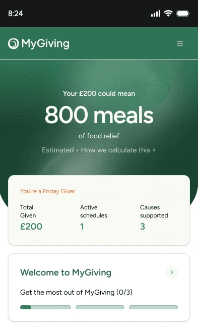
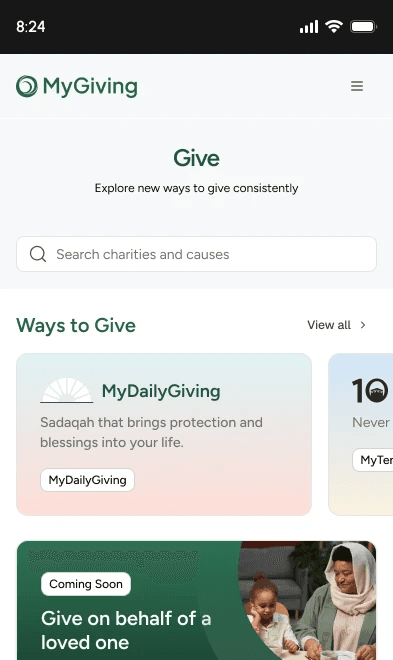
Everything in this section is proposed, not confirmed: no Figma prototype or engineering spec backs any of the three demos above. They exist to fill a real, acknowledged gap, and should be read as a starting point to react to and override, not as settled direction like the rest of this page.